Homicide & The Office - Packaging
I'm gearing up to do a WYSW on Homicide, I just want to watch the last DVD from the first season of The Dead Zone as it's when Greg Stillson and the apocalpyse first turn up it's so brilliant. Why, oh why was it cancelled before it finished?
Anyway, I managed to get the region 2 versions of series 4 and 5 for £15 a piece in HMV, which is an absolute bargain as they were £40 each a week ago. But I'm not entirely thrilled with the direction the DVD manufacturers have gone in.
I'll show you why with a snapshot of the relevant part on my DVD shelf.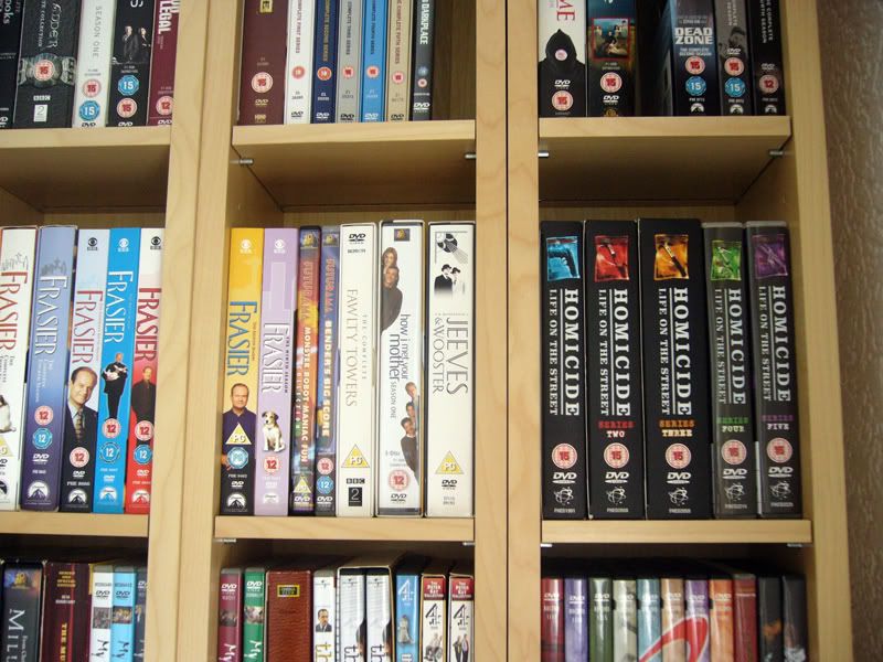
The first three seasons are in boxes that just ooze quality out of the wazoo. They're snug, tidy and have very stylish imagery on them with the white, black and coloured evidence bags/murder weapons. Now the 4th and 5th have managed to keep the colour scheme, which I must admit I love. But they've moved to the plastic transparent multi cases. Which are not only lower quality but are also shorter and smaller. So the whole set doesn't sit right when put together and also the images on the back of the 4th series are clearly stills from the first two series as they include characters who left. It's very dissappointing that the manufactuers felt the need to lower the quality of their product without dropping the price to match. Poor show.
Enjoy playing spot the show on the shelves there. Big bonus points if you can name them all. The final three in particular should be very difficult.
While I'm complaining about this kind of stuff I thought I'd share something else in the packaging front. This one is less of an oversight and more of a WTF?
It's from the cover of The Office (USA) season 2.
Unfortunately this small image doesn't quite show the true WTFery of the photoshopping on this. So I'll have to describe it a little as well. Trust me though, you want to pick up this when you're in a shop and look at it....
What this picture doesn't show you is how badly digitised the box art is. The resolution used for the actors is so low you can see individual blocky pixels with the naked eye. This is made even more confusing because the resolution used for the blinds, the text and the back of the box is exceptionally high quality. It's like this was made with some kind of bizzare in joke in mind.
As if that wasn't bad enough the actual images chosen are crimes against the people they're of. Jenna Fischer looks like she has some kind of fatal illness - perhaps the black plague - and is about to die. Steve Carrell looks like he didn't have time to pose for the photo, so they raided Madame Tussauds and used a wax-work version of him with someone elses hands opening the blinds. I say someone elses hands because the angle the top arm goes at is close to anatomatically impossible, at the very least it would be incredibly uncomfortable for him.
John Krasinski is almost unrecognisable, he's been given a new chin that looks like it was borrowed from Johnny Bravo or Brock Sampson and the photoshopped backwards in age until he appears to be twelve. Perhaps it is a photo from his high school book. I don't know.
As for poor Rainn Wilson, he's been wedged in the gap between Steve's shoulder and his not-arm at a level that makes him look like he's either 5'0" tall or Zardo the floating head. But he's better off than B.J. Novak, who appears in the image here but on the box art has been moved and can't be even seen on the front the picture. Instead he's been wrapped round and placed on the spine of the dust jacket along with the remainder of Jenna's head.
It's simply awful to the highest degree and really not what I expected to see from a show that is so exceptionally well made and produced.
The horror... The horror...


I spent approx two hours today adding titles (from last six months)to my shelves...time to call my carpenter for another shelving unit!
I don't care too much about packing as long as they stay away from the damn two-sided discs!
As for the packaging, you're right. Anything is better than two sided discs, I'm just venting for the sake of it. :D